
Introduction
Imagine entering a room and instantly recognizing a brand by the colours around you. Colours play a powerful role in how we perceive and remember a company. This easy-to-understand guide will explore the importance of choosing the right colours for your company’s branding. From understanding the psychology of colours to practical tips for selecting a colour palette, we’ll navigate through the colourful world of branding to help you make choices that resonate with your audience.
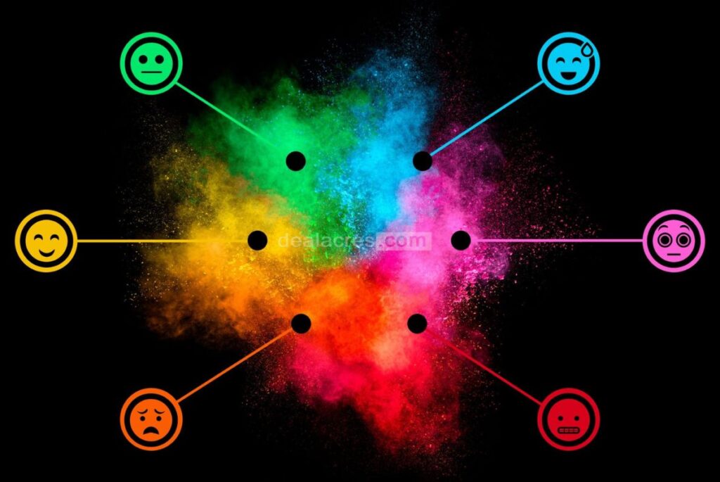
I. The Psychology of Colors
- Colour Emotions:
- Colours evoke emotions and feelings. For example, blue is often associated with trust and reliability, while red can convey energy and passion. Understanding the emotional impact of colours helps you communicate the right message to your audience.
- Brand Personality:
- Think of your brand as a person. What personality traits do you want to convey? Colours can contribute to building a brand personality – friendly, sophisticated, playful, or professional.
- Cultural Influences:
- Consider cultural associations with colours. In some cultures, certain colours have specific meanings. Awareness of cultural nuances ensures that your brand is sensitive to diverse audiences.
II. Building Your Color Palette
- Primary Color:
- Start with a primary colour that reflects your brand’s essence. This colour will often dominate your logo and overall branding materials. Choose a colour that aligns with your brand identity.
- Secondary Colors:
- Select a set of secondary colours to complement your primary colour. These colours can be used for accents, backgrounds, or additional elements in your branding. Ensure that secondary colours harmonize with your primary colour.
- Contrast and Readability:
- Consider contrast for readability. If your primary colour is dark, choose lighter secondary colours for text and vice versa. This ensures that your content is easily readable across various platforms.
III. Colors and Brand Identity
- Consistency Across Platforms:
- Maintain colour consistency across different platforms – from your website to social media and printed materials. Consistency builds brand recognition and trust.
- Logo Colors:
- Your logo is the face of your brand. Choose colours for your logo that encapsulate your brand identity. Test how the colours appear in different sizes and backgrounds to ensure versatility.
- Web and Print Colors:
- Be mindful of colour variations between digital and print materials. Colours may look different on screens than printed materials, so test and adjust as needed.

IV. Popular Brand Color Meanings
- Red:
- Often associated with passion, energy, and excitement, red is a popular choice for brands that want to evoke strong emotions. It can also convey a sense of urgency.
- Blue:
- Blue is linked to trust, reliability, and calmness. Many tech and financial brands choose blue to convey a sense of professionalism and stability.
- Green:
- Green is often associated with nature, growth, and freshness. It’s a popular choice for brands focusing on sustainability, health, or eco-friendly products.
- Yellow:
- Yellow radiates positivity, optimism, and energy. Brands that want to convey a vibrant and cheerful image often incorporate yellow into their colour palette.
- Purple:
- Purple is linked to creativity, luxury, and sophistication. It’s a favourite for brands that want to convey a sense of elegance and uniqueness.
- Orange:
- Orange combines the energy of red and the positivity of yellow. It’s associated with enthusiasm, warmth, and creativity. Many food and tech brands use orange for its vibrant appeal.
- Black and White:
- Black is often associated with sophistication, luxury, and formality, while white conveys simplicity, purity, and cleanliness. Together, black and white can create a timeless and classic brand image.
V. Testing Your Color Choices
- Audience Feedback:
- Gather feedback from your target audience. Conduct surveys or focus groups to understand how different colours are perceived. This helps ensure that your colour choices resonate with your intended audience.
- A/B Testing:
- Experiment with A/B testing on digital platforms. Present different versions of your branding materials with slight colour variations and analyze which performs better in engagement and conversion.
VI. Accessibility and Inclusivity
- Consider Color Accessibility:
- Ensure your colour choices are accessible to everyone, including those with vision deficiencies. For readability, use tools to check the contrast ratios between text and background colours.
- Inclusivity in Design:
- Embrace inclusivity in design by choosing colours easily distinguishable by a diverse audience. This demonstrates your commitment to creating an inclusive brand experience.
VII. Evolving Your Brand Colors
- Staying Relevant:
- Brands may evolve, and so can their colours. Stay attuned to changes in your industry, audience preferences, and overall brand positioning. Don’t be afraid to refresh your colour palette if needed.
- Subtle Changes:
- If you make changes, consider subtle adjustments rather than a complete overhaul. Maintaining some continuity helps in transitioning without losing brand recognition.
VIII. Tools for Choosing Colors
- Color Palette Generators:
- Utilize online colour palette generators to explore different combinations. These tools suggest harmonious colour schemes and can spark ideas for your brand.
- Adobe Color Wheel:
- Adobe Color Wheel allows you to experiment with different colour combinations and provides insights into colour theory. It’s a valuable tool for both beginners and experienced designers.

IX. Real-Life Examples
- Coca-Cola:
- Coca-Cola uses a bold red colour that conveys energy and excitement. The red, along with the iconic white script, creates a timeless and easily recognizable brand.
- Apple:
- Apple’s sleek and modern image is reinforced by its monochromatic colour scheme – predominantly white and silver. This choice aligns with Apple’s commitment to simplicity and innovation.
- Starbucks:
- Starbucks incorporates a rich green colour associated with freshness and nature. The green, combined with a contrasting white logo, creates a calming and inviting brand image.
- McDonald’s:
- McDonald’s combines red and yellow, known for their energetic and cheerful qualities. These colours reflect the fast-food chain’s vibrant and family-friendly brand.
Conclusion
Choosing the right colours for your company’s branding is not just about aesthetics; it’s about creating a visual identity that resonates with your audience. By understanding the psychology of colours, building a cohesive colour palette, and considering the cultural and emotional associations, you can craft a brand image that stands out.
Consistency across platforms, testing your colour choices, and prioritizing accessibility contribute to a positive brand experience for a diverse audience. Remember, your brand colours tell a story, and with careful consideration and adaptation, your brand can create a lasting impression in the colourful tapestry of the business world. Whether you opt for bold reds, calming blues, or vibrant yellows, the colours you choose are an integral part of your brand’s unique story.